Monday, December 6, 2010

Lab 8: Census 2000/2010


The first two maps show the population distribution of African Americans in the United States according to the 2000 U.S. Census. From the two maps, it is apparent that the Black population is concentrated in the southeast region of the United States, with some counties that have as much as 86% of African Americans. This data makes sense considering the history of the South, but the maps also show that migration has taken place with people moving to northern parts of the United States.


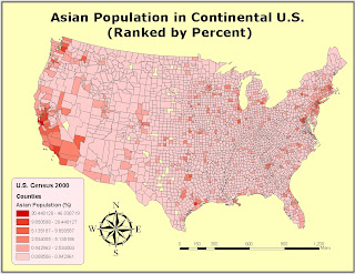
The next two maps show the population distribution of Asians in the United States with data taken from the 2000 U.S. Census. The maps have a less apparent trend but they show that Asians are mostly populated on the West Coast, especially in major cities in California with the highest percentage being 46%. This is understandable because the West Coast is the closest to Asian countries, and many have decided to stay there once they come to America.


The last two maps were created using data from the 2000 U.S. Census and they show the population distribution of "Some Other Race" ranked by percent. The maps show that people identified as "Some Other Race" are mostly populated in the southwest regions of the United States, with the highest percentage being 39%. I would suspect that they are Latin Americans due to the fact that Mexico is the neighboring country.

I have learnt a lot about what GIS is and how useful and applicable it is to analyze and solve real-life problems. Even though this is a very interesting subject, it is very challenging and my experiences with GIS were not always pleasant. There were lots of times when I got really frustrated with saving data at different places and having to redo the whole thing, but overall I enjoyed the class.

Tuesday, November 23, 2010

Lab 7: Mapping the Station Fire in ArcGIS


The Station Fire in Los Angeles County started on August 26, 2009 and was fully contained on October 16, 2009 at at 7:00 p.m. The fire burned approximately 160,577 acres of land and destroyed 209 structures, including 89 homes. It was the largest fire in Los Angeles County and the tenth largest fire in California since 1933. The fire started in the Angeles National Forest and severely affected the cities around it.
The first map shows the perimeters of the Station Fire from August 29, 2009 to September 2, 2009 at many different times. The second map only shows the perimeters of the fire on August 29, 2009 at 2:48 a.m. and September 2, 2009 at 7:02 a.m. It can be inferred from the second map that fire tends to go up the slope by looking at the elevation changes. The fire went from the red perimeter upwards toward the purple mountain and its final position is depicted by the orange perimeter.
The Station Fire affected many of its surrounding cities which included La Cañada Flintridge, Glendale, Acton, La Crescenta, Littlerock, Altadena, Sunland, and Tujunga (Wikipedia). None of these cities are actually within the perimeters of the fire according to my second map, which shows how destructive the fire was as it could affect its surrounding cities as well. Many people in these cities were forced to evacuate and there were a lot of people in other cities that were affected by the smoke and the ashes in the air.
The theme of my map is the effects of the Station Fire on potential cities. Condor Peak is the only place that is fully within the perimeters of the fire, so I hypothesize that it would receive the most damage by the fire. The cities in the San Gabriel Valley below the fire would experience aftermath of the fire such as bad air quality caused by the smoke and ashes.
This week's lab is really interesting because I remember seeing the fire in the mountains from my home back in Arcadia, but I had never really thought about how the fire moved or how it affected its surroundings back then. I think it is incredible that ArcGIS can be used to analyze patterns and provide explanations for situations that happen in real life.
Works Cited
"2009 California wildfires." Wikipedia, the free encyclopedia. 2009. Web. 23 Nov. 2010.
Archibold, Randal C. "After a Devastating Fire, an Intense Study of Its Effects." New York Times. 2 Oct. 2009. Web. 23 Nov. 2010. 
"How Did the Station Fire Start." Slate. 3 Sep. 2009. Web. 23 Nov. 2010.
"State of the Climate Wildfires Annual 2009." U.S. Department of Commerce. 8 Jan. 2010. Web. 23 Nov. 2010.
"Station Fire." Incident Information Web. 10 Nov. 2009. Web. 23 Nov. 2010.

Wednesday, November 17, 2010

Lab 6: DEMs in ArcGIS


I chose to do this lab assignment on Grand Canyon because it is a famous attraction located in Arizona. It is a steep canyon carved by the Colorado River and known for its dramatic elevation changes. The geographic coordinate system used is the North American Datum of 1983. The extent information (in decimal degrees) of my original DEM is:
Top: 36.3608333326
Left: -112.540277777
Right: -111.69361111
Bottom: 35.9647222214

Tuesday, November 9, 2010

Lab 5: Projections in ArcGIS


Getting Started Questions:
How many degrees does the equator span?
360 decimal degrees
How many degrees do the northern- and southern-most graticule lines span?
180 decimal degrees
What do these two lines in fact represent?
These two lines represent the total distance in decimal degrees around the Earth latitudinally and longitudinally.
Approximately how many miles separate Washington, D.C. and
Afghanistan when crossing the Atlantic?

6,913.151 miles
Mercator Projection: 
Is Alaska really bigger than Brazil?
Yes
What about Greenland?
Yes
How far is Washington, D.C. from Kabul now?
10,110.689 miles 

Map projection is essential in creating maps as it allows a better understanding of the three-dimensional world by representing it on a two-dimensional surface. It also provides a more transportable model as well. Cylinders, cones, and planes are all used to create map projections. Map projections are constructed to preserve one or more of the map regions properties including area, shape, direction, bearing, distance, and scale. Different map projections exist depending on the purpose but no map can perfectly represent the surface of the entire Earth.

Equal area projections such as the Bonne projection and the Sinusoidal projection preserve area. They keep the areas on the Earth and their corresponding areas on the equal area map proportional. In other words, given any two regions A and B on the Earth and their corresponding regions A' and B' on the map, the surface ratios of A to A' and B to B' are the same.

Equidistant projections preserve distance from some standard point or line. These include the equidistant cylindrical projection and the equidistant conic projection. They maintain equal distances from the center of the projection to any other place on the map in all directions, but area is distorted as a result.

In conformal projections such as the Mercator projection and the Gall Stereographic projection, angles are preserved locally. The Mercator projection is the most widely-used conformal projection. It is a cylindrical map projection and is used for nautical purposes because of its ability to represent rhumb lines as straight segments. It is good for preserving the angles and the shapes of small objects, but it distorts the size and shape of large objects as the scale increases from the equator to the poles.

Map projection is the method of taking the surface of a sphere or other shapes and representing it on a plane. Inevitably, distortions occur during the transformation of a 3-D model to a 2-D surface and some information is lost in this process. Despite these perils, map projection is significant in creating maps and its variablility allows the user to choose and construct the best-possible representation of the desired model depending on the situation.

Wednesday, November 3, 2010

Lab 4: Introducing ArcMap

This week's lab was a lot more difficult than last week's lab exercise. While Googlemap was relatively straightforward and easy to understand, GIS was really difficult and confusing for me even with the tutorial.This further reinforces the point that neogeography is for amateurs while GIS is for professionals. Even though it is quite complicated to use, GIS has proven to be an effective and helpful mapping tool.

A problem I encountered while doing the lab was saving the data onto different computers, so when I opened my completed project on another computer some of the data and the graph were no longer present. I ended up having to redo the whole thing several times to finally get it right. Another problem I had was not being able to undo some of the things such as color changes and had to change it back manually.

GIS has great potential in helping users understand the spatial relationship between a place and its attributes through the use of maps. It lets users incorporate graphs and maps together to better understand and solve real-world situations. For example, the map for this lab exercise is used to help people understand the relationship between the airport noise and its surrounding population so that measures can be taken to solve this problem. GIS is extremely helpful in mapping out data, visualizing the relationship between data, and analyzing the data.

Despite its potentials, GIS contains certain pitfalls as well. First of all, GIS is not user-friendly for first-time users. A lot of steps have to be taken to perform a simple operation. The program can be very confusing for amateurs unless they go through the tutorial several times. Another downside of GIS is that it is not easily accessible by the public since the program is quite expensive. Therefore, GIS is mostly utilized by professionals and the government to understand real-life problems and develop ways to solve them.


Wednesday, October 20, 2010

Lab 3: Neogeography


View Sightseeing in Taipei Utilizing the MRT in a larger map

I chose to do a map on popular places in Taipei that can be reached utilizing the Taipei MRT (Municipal Rapid Transit). The traffic in Taipei is highly congested, making the MRT the most popular transportation because it is cheap, convenient, and accessible. The line connecting Taoyuan International Airport to Chiang Kai-Shek Memorial Hall Station shows the route that one must take by bus or taxi from the airport to the MRT station because currently there is no station at the airport yet. According to Taipei Times, "The MRT line connecting Taipei to Taiwan Taoyuan International Airport is scheduled to open in 2014." I chose Chiang Kai-Shek Memorial Hall to be the first stop because it is at the heart of Taipei. From there, one can take the MRT train to various types of attraction in Taipei, such as the famous Shilin Nightmarket or the Taipei Zoo.

Neogeography is the creating and sharing of maps to offer insight on a personal level. According to Turner (2006), neogeography is about “…people using and creating their own maps, on their own terms and by combining elements of an existing toolset. Neogeography is about sharing location information with friends and visitors, helping shape context, and conveying understanding through knowledge of place.” Neogeography offers insight on a more personal level than GIS in that the maps are drawn from personal experiences. However, this form of mapping can contain certain pitfalls. Unlike GIS, neogeograpraphy is used by amateurs, so the results can be a bit biased because people view things from different perspectives. The information presented by the maker can also be misleading because of misinterpretation. Nevertheless, neogeography has great potential because it is flexible and can be changed, whereas GIS is rigid. Neogeography lets people learn from other people’s experiences and gain valuable information from the world around them.


Sources:
George, Maxine. "Madame Chiang- The Dragon Lady Who Bridged the East and the West." Oct 20, 2010. http://www.magiccarpetjournals.com/Madame-Chiang.htm
Papahapon2. "Taiwan Taoyuan International Airport." Oct 20, 2010. http://www.youtube.com/watch?v=9cvDt1FX-m8
Shuflies. "228 Memorial Museum." Oct 20, 2010. http://shuflies.blogspot.com/2008_01_01_archive.html
Thomashan1. "Baby bear playing at Taipei zoo." Oct 20, 2010. http://www.youtube.com/watch?v=N74Z9eDEr6M

Wednesday, October 13, 2010

Lab 2: USGS Topographic maps

1. What is the name of the quadrangle?
Beverly Hills Quadrangle

2. What are the names of the adjacent quadrangles?
Canoga Park, Van Nuys, Burbank, Topanga, Hollywood, Venice, Inglewood

3. When was the quadrangle first created?
1995

4. What datum was used to create your map?
National Geodetic Vertical Datum of 1929

5. What is the scale of the map?
1:24,000

6. At the above scale, answer the following:
a) 5 centimeters on the map is equivalent to how many meters on the ground?
1200 m (0.05x24000)
b) 5 inches on the map is equivalent to how many miles on the ground?
1.89394 miles (5x24000/5280/12)
c) one mile on the ground is equivalent to how many inches on the map?
2.64 in. (1x5280x12/24000)
d) three kilometers on the ground is equivalent to how many centimeters on the map?
12.5 cm (300000/24000)

7. What is the contour interval on your map?
20 feet

8. What are the approximate geographic coordinates in both degrees/minutes/seconds and decimal degrees of:
a) the Public Affairs Building;
Degrees/minutes/seconds: 34°4'30"N, 118°26'00"W
Decimal degrees: 34.075°N, 118.433°W
b) the tip of Santa Monica pier;
Degrees/minutes/seconds: 34°0'27"N, 118°30'00"W
Decimal degrees: 34.0075°N, 118.5°W
c) the Upper Franklin Canyon Reservoir;
Degrees/minutes/seconds: 34°7'10"N, 118°24'25"W
Decimal degrees: 34.119°N, 118.407°W

9. What is the approximate elevation in both feet and meters of:
a) Greystone Mansion (in Greystone Park);
560ft; 170.688m
b) Woodlawn Cemetery;
140ft; 42.672m
c) Crestwood Hills Park;
620ft; 188.976m

10. What is the UTM zone of the map?
Zone 11

11. What are the UTM coordinates for the lower left corner of your map?
3,763,000m N; 362,000m E

12. How many square meters are contained within each cell (square) of the UTM gridlines?
(363,000 - 362,000) x (3,764,000 - 3,763,000) =1,000,000 square meters

13. Obtain elevation measurements, from west to east along the UTM northing 3771000, where the eastings of the UTM grid intersect the northing. Create an elevation profile using these measurements in Excel (hint: create a line chart). Figure out how to label the elevation values to the two measurements on campus. Insert your elevation profile as a graphic in your blog.

14. What is the magnetic declination of the map?
14 degrees East

15. In which direction does water flow in the intermittent stream between the 405freeway and Stone Canyon Reservoir?
From North to South

16. Crop out (i.e., cut and paste) UCLA from the map and include it as a graphic on your blog.

Wednesday, October 6, 2010

Lab 1: Maps

The "Marauder's Map" from the book "Harry Potter" is one of my favorite maps. It was created by James Potter, Sirius Black, Remus Lupin, and Peter Pettigrew during their school days at Hogwarts. It is a magical map that gives a detailed layout of Hogwarts, including its hidden passageways and other mysteries. The map appears to be a blank sheet of parchment that is only activated when the user points his or her wand at the map and says, "I solemnly swear that I am up to no good." The map will return to its original blank state when the user says, "mischief managed." What I find interesting about the map is that it also shows where the people are located. The last picture above shows Albus Dumbledore pacing around in his room. The map is very trustworthy in that it cannot be fooled by disguises such as Polyjuice Potion and Invisibility Cloak. ( From the blog "99 Red Balloons" http://ninety9-redballoons.blogspot.com/2009/08/click-click.html)


This is a map of the Taipei MRT( Municipal Rapid Transit). The map shows the rail lines as well as the stations, letting travelers know which lines to take in order to go to their desired locations. The map also provides a key of the rail lines and their corresponding colors. What I find interesting about the map is that it also shows future lines in faded colors. According to Taipei Times, "The MRT line connecting Taipei to Taiwan Taoyuan International Airport is scheduled to open in 2014," which will be a lot more convenient for travelers because currently they have to take buses to go from the airport to other places. The MRT is a popular transportation in Taipei and is widely used by children and adults alike. ( From the blog "Memoirs on a Rainy Day" http://range.wordpress.com/2007/01/23/mrt-taipei-taiwan-status/)


This is a map of the Disneyland theme park. The map provides a general layout of the park and has drawings of the rides to allow people to easily find what they are looking for. The map uses numbers to designate where the restaurants and shops are in the park. It also has symbols of the restrooms and the telephones. What I find interesting about the map is that each of the eight themed areas ( Main Street, U.S.A., Adventureland, New Orleans Square, Frontierland, Critter Country, Fantasyland, Mickey's Toontown, Tomorrowland) has its own color, which makes it a lot easier for people to find the numbers in that area. The map also uses bold and vivid colors that appeal to the people. ( From "Chip & Company" http://www.chipandco.com/2010/01/disneyland-refurbishment-schedule-2010/)